
Mantine
v.Kengo
Search
+ K
A fully featured React components library
A fully featured React components library
A fully featured React components library
Build fully functional accessible web applications faster than ever –Mantine includes more than 100 customizable components and 40 hooks to cover you in any situation
Build fully functional accessible web applications faster than ever –Mantine includes more than 100 customizable components and 40 hooks to cover you in any situation
Free and open source
All packages have MIT license, you can use Mantine in any project
TypeScript based
Build type safe applications, all components and hooks export types
Use anywhere
Mantine supports all modern frameworks: Next.js, Remix, etc.
Free and open source
All packages have MIT license, you can use Mantine in any project
TypeScript based
Build type safe applications, all components and hooks export types
Use anywhere
Mantine supports all modern frameworks: Next.js, Remix, etc.
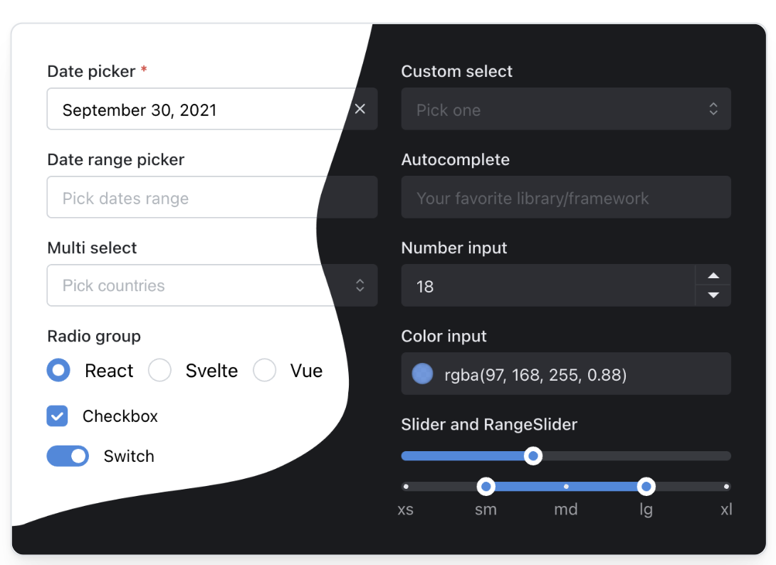
100 + COMPONENTS
100 + COMPONENTS
Inputs
20+ input components
Date pickers
Calendar, date pickers, time inputs
Overlays & Navigation
Modal, HoverCard, Tabs, Stepper
Content
Accordion, Timeline
Rich text editor
Tiptap based rich text editor
Carousel
Embla based carousel
Every input can have description...
...and error
Every input can have description...
...and error
DARK COLOR SCHEME
DARK COLOR SCHEME
Add dark theme to your application with just a few lines of code – Mantine exports global styles both for light and dark theme, all components support dark theme out of the box.
Add dark theme to your application with just a few lines of code – Mantine exports global styles both for light and dark theme, all components support dark theme out of the box.
STYLES OVERRIDING
STYLES OVERRIDING
Each Mantine component supports styles overriding for every internal element inside with classes or inline styles. This feature alongside other customization options allows you to implement any visual modifications to components and adapt them to fit almost any design requirements.
Default slider styles
20%
50%
80%
Find elements that you need to change in styles API table
Name
Description
root
Root element
track
Track element, contains all other elements
bar
Filled part of the track
thumb
Main control
dragging
Styles added to thumb while dragging
label
Label element, displayed above thumb
markWrapper
Wrapper around mark, contains mark and mark label
mark
Mark displayed on the track
markFilled
Styles added to mark when it is located in filled area
markLabel
Mark label, displayed below track
Then apply styles and add other props:
20%
50%
80%
Then apply styles and add other props:
20%
50%
80%
FLEXIBLE THEMING
FLEXIBLE THEMING
Extend default theme with any amount of additional colors, replace shadows, radius, spacing, fonts and many other properties to match your design requirements.
BRIGHT PINK BADGE
BASED ON EMOTION
BASED ON EMOTION
Mantine is based on emotion 👩🎤, take advantage of core emotion features: auto vendor-prefixing, critical css extraction during server side rendering, lazy evaluation, dynamic theming, type safe styles with TypeScript and more.
Add inline styles to any component with sx prop:
HOOKS LIBRARY
HOOKS LIBRARY
use-element-size
Subscribe to element size changes
use-debounced-value
Debounce value changes
use-idle
Detect if user does nothing
use-fullscreen
Enter/exit fullscreen
use-scroll-lock
Lock scroll at current position
use-form
Forms management library
Resize textarea by dragging its right bottom corner
Resize textarea by dragging its right bottom corner
BUILD EVEN FASTER WITH MANTINE UI
120+ responsive components
built with Mantine
your next website even faster with premade responsive components designed and built by Mantine maintainers and community. All components are free forever for everyone.
READY TO GET STARTED?
READY TO GET STARTED?
Mantine works in all modern environments – get started instantly with Next.js, Gatsby.js, create-react-app, Vite or Remix by following getting started guide:


JOIN THE COMMUNITY
JOIN THE COMMUNITY
Join Discord community
Ask questions, participate in new features discussions, see what people have built
Follow on Twitter
Get notified about new minor and major releases
Start a discussion
Request new features, ask questions and provide feedback with GitHub discussions
Join Discord community
Ask questions, participate in new features discussions, see what people have built
Follow on Twitter
Get notified about new minor and major releases
Start a discussion
Request new features, ask questions and provide feedback with GitHub discussions
Mantine
Build fully functional accessible web applications faster than ever
About
About
Contribute
About Mantine
Changelog
Releases
Community
Chat on Discord
Follow on Twitter
About Mantine
Follow on Github
GitHub discussions
Project
About
Mantine UI
Documentation
Github organization
pm organization
About
About
Contribute
About Mantine
Changelog
Releases
Community
Chat on Discord
Follow on Twitter
About Mantine
Follow on Github
GitHub discussions
Project
About
Mantine UI
Documentation
Github organization
pm organization
Built by Vitaly Rtishchev and these awesome people